Armature in a circle
The origins of the Bosch logo
What makes a company visually unique and ensures recognition is its brand logo. The armature in a circle has stood for Bosch since 1918. How the logo came about has to do with a bit of world history and some ingenious inventors.
A good idea
It was a cold November day in 1918. Bosch’s chief engineer Gottlob Honold, in his presumably cozy office at the company’s Stuttgart headquarters, was thinking about a new trademark for Bosch products. His efforts yielded the “armature in a circle,” which became the company’s new logo. Modeled on the ignition armature in the magneto ignition device, it wasn’t a completely new invention, but was instead based on the models of older brands. It was intended to reflect the desire for clear lines that prevailed at the time and replace all the old logos. The result was a uniform brand image.
Unmistakable
For thousands of years, people have been marking their work with a unique symbol that can be identified only with them — mainly for reasons of quality and trade affiliation. The economic aspect of marking a product became important with increasing industrialization in the 19th century. To differentiate themselves from competitors and make their own products unmistakable, more and more logos became established, some of which were characterized by sophisticated typography and graphics. One of the logos from this period that is still well-known today is the one belonging to Coca-Cola. The curvaceous lettering was specially designed for the logo, which gained protection as a trademark in 1886.
Protection needed
Coveted products quickly attracted imitators who, in particularly brazen cases, took over not only a manufacturer’s design but also its labeling. As a result, more and more measures to protect trademarks were introduced worldwide from the 1870s onward. Germany’s Act on the Protection of Trade Marks came into force on October 1, 1894. That meant trademarks could be registered with the imperial patent office and thus protected. Robert Bosch’s “Workshop for Precision Mechanics and Electrical Engineering,” founded in 1886, registered its first trademark, the “burning magnet,” on March 3, 1899. The template for the first logo was the magneto ignition device, which was Bosch’s main manufactured product. This logo was embossed on the device next to the word “Bosch” in capital letters.
Versatile use
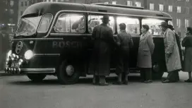
The young company also used the burning magnet as the letterhead on its correspondence. Even the new Bosch branch in New York, which opened in 1906, still used this logo. Only in France and the U.K., where Bosch sold its own products in a joint venture with Frederick Simms until 1907, was there a different trademark at the partner’s request. This alternative was the “sparking armature,” another reference to the magneto ignition device — in this case, to its core component. In the early years, use of the trademark was limited to embossing on products and to official business correspondence. It didn’t appear for advertising purposes. Instead, starting in 1910, Bosch used the “red devil,” which made the company’s products famous and was itself also registered as a trademark.
New trademark needed
The first world war changed things. Bosch lost property, trademark rights, and patents in the countries that were hostile to Germany during the war. In the U.S., the Bosch company was expropriated and sold, after which the new owner simply continued to use the successful Bosch name and advertised with the red devil. To prevent unwanted confusion, Bosch needed to establish a new trademark — which chief engineer Gottlob Honold saw to on that cold November day.
Suitable for all kinds of use
As with so many other products from Honold’s pen, the implementation of this idea was dominated by precision down to the last millimeter. The requirements for the new logo were clearly defined: It was to be a simple line design that could be easily engraved on even the smallest products and spare parts. It had to be distinctive and at the same time be understood around the world — in other words, it couldn’t contain any letters. And the new symbol should also be usable in advertising materials. On May 2, 1919, the armature in a circle was officially registered as a trademark at the patent office.
A brilliant introduction
To publicize the new logo to business partners and customers, Bosch commissioned a poster from renowned graphic designer Lucian Bernhard. The poster made its first major appearance at the Berlin Motor Show in the fall of 1921. It later appeared as an advertisement in numerous media worldwide and was translated into 13 languages. The new trademarked logo, the armature in a circle, replaced all previously used brands and logos, and the logotype “BOSCH” was changed to “ROBERT BOSCH” when engraved on products. This change was due to the potential for confusion with the American competitor, which called itself “American Bosch.”
The trademark is a thing in itself, not an ornament; it is the main thing, not an accessory.
Advertisements now always featured the Bosch logo and name in brush lettering, also designed by Lucian Bernhard. This was also the first time that the now typical red was used for the Bosch lettering. By 1925, Bosch had achieved such a high profile worldwide — with the exception of the U.S. — that it was once again possible to leave out “Robert” and simply use “BOSCH.” Initially, the symbol and logotype were not necessarily used together. It wasn’t until the 1950s that the advertising department at Bosch became increasingly committed to this, and in 2004, the two elements were brought together in a way that is still inseparable today.
However, it all started with the logo created in 1918, which implemented the principles Robert Bosch considered essential for trademarks: “The trademark must also be simple, which is why the well-known, good trademarks, i.e. the best of them, are simple line designs (...) trademarks must be simple and clear if they are to be impressive and easily remembered.” And Bosch’s “armature in a circle” has been firmly anchored in customers’ memories — for more than 100 years.
Author: Christine Siegel